If you run a website on Squarespace, your images do a lot of heavy lifting. They show off your products, your portfolio, your blog content, and your brand. But if the size looks off, your layout can feel unbalanced, pages may load slowly, or important details may get cropped out. That is why learning how to Resize Image in Squarespace properly is such an important skill, even if you are not a designer or developer.
The good news is that Squarespace gives you built-in tools to control how images appear on your pages. You do not need Photoshop knowledge or coding experience to make meaningful improvements. Once you understand how the platform handles image sizing and layout, you can quickly Resize Image in Squarespace in a way that looks clean on desktop, tablet, and mobile.
In this tutorial, we will walk through how image sizing works in Squarespace, then go step by step through different situations: resizing images inside image blocks, galleries, and section backgrounds. We will also talk about how to prepare your files before you upload them, and how to fix common problems like blurry or stretched images. By the end, you will be able to confidently Resize Image in Squarespace without breaking your layout or hurting your site’s performance.
How Squarespace Handles Image Sizes
Before you try to Resize Image in Squarespace, it helps to understand how the platform thinks about images. Squarespace is a responsive website builder, which means your site automatically adjusts to different screen sizes. Instead of setting a fixed width in pixels for every image, Squarespace uses a mix of image blocks, content widths, and breakpoints to control how things appear.
When you upload an image, Squarespace stores a high-resolution version and automatically generates multiple smaller versions in the background. When visitors load a page, Squarespace serves the most appropriate version based on the visitor’s device and screen size. This system is great for speed, but it also means that when you Resize Image in Squarespace, you are usually changing the display size and layout, not the actual underlying file resolution.
Most of your control comes from how you place the image on the page and what kind of block or section you choose. Image blocks, gallery blocks, and background images each behave a little differently. When you Resize Image in Squarespace, you are often adjusting the width of the block, the column layout, or the section height rather than manually typing in exact pixel dimensions. Once you get used to this approach, it becomes much faster and more intuitive.
Preparing Your Files Before You Resize Image in Squarespace
Even though Squarespace can resize and optimize images on its own, it is still smart to prepare your files before you upload them. If you start with huge files straight from a camera, your pages may still feel slow, and you will have less control over sharpness and detail when you Resize Image in Squarespace. A good habit is to resize and compress your images to a reasonable maximum width, such as 1800–2500 pixels, depending on how large you plan to display them.
Aspect ratio matters as well. If you know a banner will be wide and short, try to crop it to a wide ratio like 16:9 before uploading. If you know a product image should be almost square, aim for something close to a 1:1 ratio. When you later Resize Image in Squarespace, you will see that layouts look more consistent if the images already share similar aspect ratios.
File format is another thing to consider. Photographs are usually best as JPEGs, while graphics, logos, and screenshots can be clearer as PNGs. If you care about maximum performance, you can also use modern formats like WebP if your tools support them. Starting from good source files makes every step you take to Resize Image in Squarespace more effective and predictable, instead of fighting against images that are too big, too small, or badly cropped.
Resize Image in Squarespace Using Image Blocks
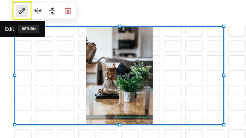
Most people first learn to Resize Image in Squarespace when working with image blocks on a regular page. An image block is the basic piece of content you drag into a section to place a single image. It can sit alone, next to text, or inside a grid layout depending on how your page is structured.
To use this method, you typically start by editing the page and adding or selecting an existing image block. When you hover over the block, you will see options to replace the image, adjust the design, and sometimes drag the edges of the block. Each of these tools plays a role when you Resize Image in Squarespace. If you drag the block boundary in a column layout, you can make the image occupy more or less horizontal space relative to other content next to it.
In many templates, the width of the content area is controlled by the section layout. That means when you Resize Image in Squarespace on a page, you may also need to adjust the column layout or section width. For example, switching from a two-column layout to a single column will make your image appear larger, even if the underlying file does not change. Conversely, placing the same image into a narrow column next to text will make it appear smaller and more compact.
Inside the image block’s design settings, you can often choose different styles such as Inline, Poster, Card, or Stack. Each style controls how the image sits in relation to text. When you Resize Image in Squarespace using these styles, you are effectively choosing different combinations of image width, alignment, and text wrapping. Experimenting with these design options helps you quickly find a layout where the image feels proportionate to the surrounding content.
Fine-Tuning Display Size and Alignment
Once you have the general layout in place, the next step is to fine-tune how large the image feels within its block. When you Resize Image in Squarespace at this level, look at the surrounding whitespace, margins, and padding. If everything feels too cramped, consider widening the column or choosing a layout that gives the image more breathing room. If it feels too dominant, reduce the column width or move the image below the text so that it stretches across a smaller portion of the screen.
You can also change alignment settings within the block or section. Centering an image will make it feel more prominent, while left-aligning it within a column can make it feel more integrated with text. These softer adjustments are a big part of what it means to Resize Image in Squarespace in a way that feels intentional. It is not just raw pixel size; it is also about visual weight and balance.
Another detail that matters is the image’s focal point. Many Squarespace setups allow you to click on the image and set a focal point that tells the platform which part is most important. When you Resize Image in Squarespace and the layout crops or scales the image, Squarespace uses the focal point to keep faces, products, or key details visible as much as possible. This is especially helpful in responsive designs where the same image must look good on both narrow and wide screens.
Resize Image in Squarespace Galleries
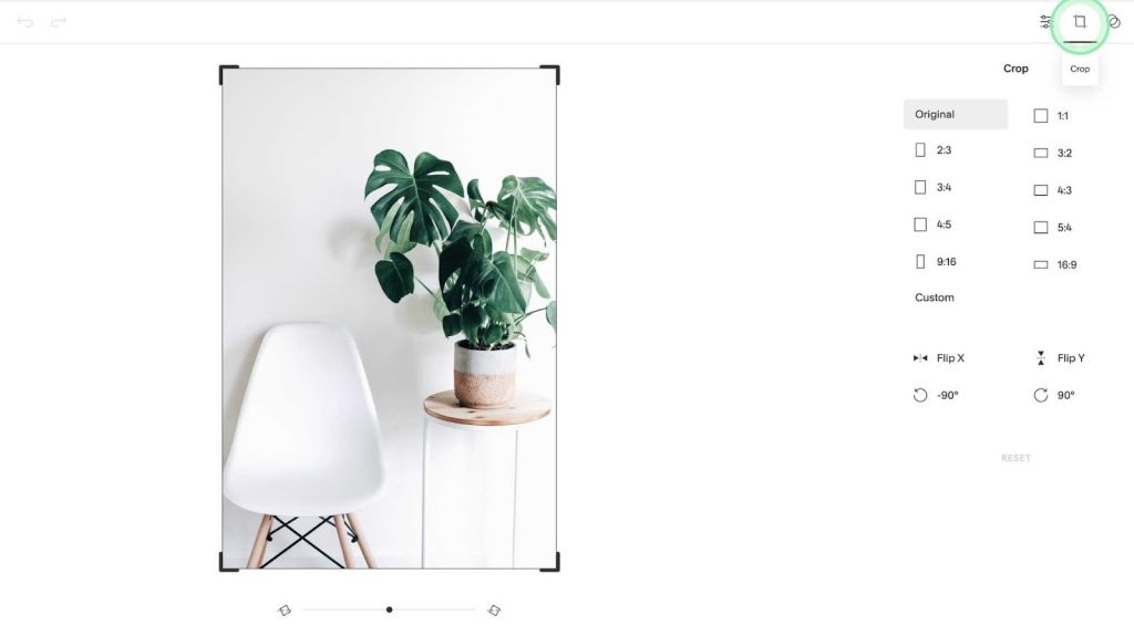
Galleries are a different scenario because you are dealing with a collection of images rather than a single image block. When you create a gallery section or gallery block, Squarespace gives you layout options such as grid, slideshow, carousel, or stacked. Each layout has its own rules for how images are sized relative to one another. To Resize Image in Squarespace in a gallery, you will usually adjust settings like number of columns, aspect ratio, and gutter (the space between images).
If you choose a grid gallery, you can often set a fixed aspect ratio like square, 3:2, or 16:9. When you select one of these options, Squarespace will crop and scale each image to match that ratio. This is one of the most powerful ways to Resize Image in Squarespace for a consistent gallery look, especially for portfolios and product grids. You do not need to crop each image manually; the system does it for you based on the ratio you choose.
The number of columns is another key control. Fewer columns mean each image appears larger; more columns mean smaller individual images but more items visible at once. When you Resize Image in Squarespace inside a gallery, try adjusting columns and aspect ratio together. For example, a two-column grid with a 3:2 ratio will feel very different from a four-column grid with square thumbnails. Watching these changes in live preview helps you choose a balance that fits your content.
In slideshow or carousel layouts, the image usually fills a container that stretches across the width of the section. In these cases, to Resize Image in Squarespace, you may mainly adjust section width and height, or modify the spacing above and below the gallery. You can also set the gallery to show thumbnails under or beside the main image, which changes the overall size of the viewing area and how much space the main image occupies on the page.
Resize Image in Squarespace Section Backgrounds
Section backgrounds are another common place where people want more control. A hero banner at the top of your homepage, for example, often uses a full-width background image with text layered on top. This can look beautiful, but it can also be confusing if you do not know how to Resize Image in Squarespace in this context. Background images behave differently from regular image blocks because they are designed to cover the entire section area.
In most templates, you do not directly drag the background image to resize it. Instead, you control the section’s height and content to indirectly Resize Image in Squarespace for backgrounds. When you increase the section height, more of the image becomes visible vertically; when you decrease it, the image gets cropped tighter. Squarespace usually uses a “cover” mode, which enlarges the image until it fully fills the container, so parts will always be cropped depending on the screen size.
To refine the look, you can adjust the section layout, spacing, and content alignment. If your text is short, you might reduce padding so the section does not feel overly tall. That effectively helps you Resize Image in Squarespace by forcing the background to show only the most essential area. Setting the focal point again matters here, because it tells Squarespace which part of the background image to keep visible as the section reshapes itself on smaller screens.
If your background image looks blurry or stretched, it may be that the original file is too small for such a large area. In that case, the best solution is to upload a larger, higher-resolution image before you try to Resize Image in Squarespace for that hero section. Starting with a file that has enough resolution to cover large monitors will keep the section sharp and professional, especially for visitors using big displays.
Resize Image in Squarespace on Mobile
One important part of modern web design is checking how everything looks on phones. Squarespace provides built-in mobile previews, and you should use them every time you Resize Image in Squarespace. An image that looks perfect on a laptop can appear too tall, too small, or oddly cropped on a smartphone if you are not careful about layout.
When you switch to mobile view in the editor, you will often notice that multi-column layouts collapse into a single column. That means any images that were sitting beside text on desktop may now appear above or below it. This automatic stacking can dramatically change how large an image feels. To Resize Image in Squarespace in a mobile-friendly way, you might need to adjust section spacing, rearrange blocks, or simplify complex layouts so that images do not dominate the screen.
Because Squarespace is responsive, you usually do not set separate pixel sizes just for mobile. Instead, you make layout decisions that work well at all sizes. For example, you might avoid extremely tall background images that push important content far down the screen on a phone. As you Resize Image in Squarespace, keep asking yourself how it feels to scroll. Mobile visitors usually appreciate shorter, more focused sections with images that communicate quickly without overwhelming them.
If you notice that key details in an image are being cropped out on mobile, revisit the focal point and section height. These two controls often make the biggest difference when you Resize Image in Squarespace for different devices. Testing on an actual phone or at least a narrow browser window can give you a more realistic sense of what your visitors experience.
Troubleshooting Common Problems When You Resize Image in Squarespace
Even when you follow best practices, you might run into some common issues. One frequent complaint is that images look blurry or soft after you Resize Image in Squarespace. This usually means that the original file is too small, or the compression is too aggressive. Try uploading a larger version with less compression. Make sure your original is at least as wide as the largest size you expect it to appear on screen.
Another issue is awkward cropping. When you Resize Image in Squarespace, especially in galleries and background sections, the platform often crops the image to fit the chosen aspect ratio or container. If important parts of the image are cut off, adjust the focal point first. If that is not enough, consider cropping the image manually before upload to better match the required shape. That way, Squarespace’s automatic cropping will feel more natural.
Slow loading is another pain point. If you upload very large files and then Resize Image in Squarespace only through layout controls, the site might still feel heavy. It is better to compress images and reduce their resolution before uploading. Aim for a balance between quality and file size. Squarespace already optimizes images, but starting from huge, unoptimized files forces the system to work harder and can still hurt performance.
Sometimes, images do not line up the way you expect. When you Resize Image in Squarespace with multiple image blocks or gallery items in a row, small differences in aspect ratio can cause uneven rows or strange gaps. To fix this, try to use images with similar shapes for grids, or rely on fixed aspect ratio settings in gallery layouts. Consistency in your source images makes it much easier to achieve a clean, professional result.
Best Practices to Keep in Mind as You Resize Image in Squarespace
As you practice, a few habits will make your workflow smoother. First, always preview your changes on both desktop and mobile before publishing. When you Resize Image in Squarespace, small adjustments in the editor can have a big impact on how the page feels to visitors. Taking a moment to preview can prevent surprises.
Second, think in terms of sections and layouts, not just individual images. Squarespace is built around sections with specific structures. When you Resize Image in Squarespace, you are usually working within the rules of a particular section layout. Choosing the right layout from the start often saves time because the images flow into a sensible structure without constant tweaking.
Third, remember that less is often more. Giant images everywhere can make a site feel slow and overwhelming. By carefully choosing where to Resize Image in Squarespace for maximum impact, you can highlight your most important visuals while keeping the overall experience clean and focused. This is especially important for portfolios, blogs, and ecommerce pages where users need to scan and understand information quickly.
Finally, do not be afraid to experiment. Try different image block styles, gallery layouts, and section heights. Each template can behave a bit differently, so the best way to learn how to Resize Image in Squarespace with confidence is to test variations and see what feels right for your brand.

Need Perfectly Sized Images? Get Help from an Image Editing Service
If all of this feels like a lot to manage, or if you simply want your visuals to look as polished as possible, you do not have to do everything alone. When you Resize Image in Squarespace, the platform gives you helpful tools, but the quality of your images still depends heavily on how they are edited, cropped, and prepared beforehand. That is where a professional Image Editing Service can save you time and improve your results.
Instead of spending hours manually adjusting exposure, cropping, or background cleanup before you Resize Image in Squarespace, you can hand off that part of the workflow to specialists. They can deliver consistent aspect ratios, clean backgrounds, and properly compressed files that are ready to drop into Squarespace sections, galleries, and banners. Once those optimized images are in place, it becomes much easier to Resize Image in Squarespace using the built-in design controls while still maintaining a sharp, cohesive look.
